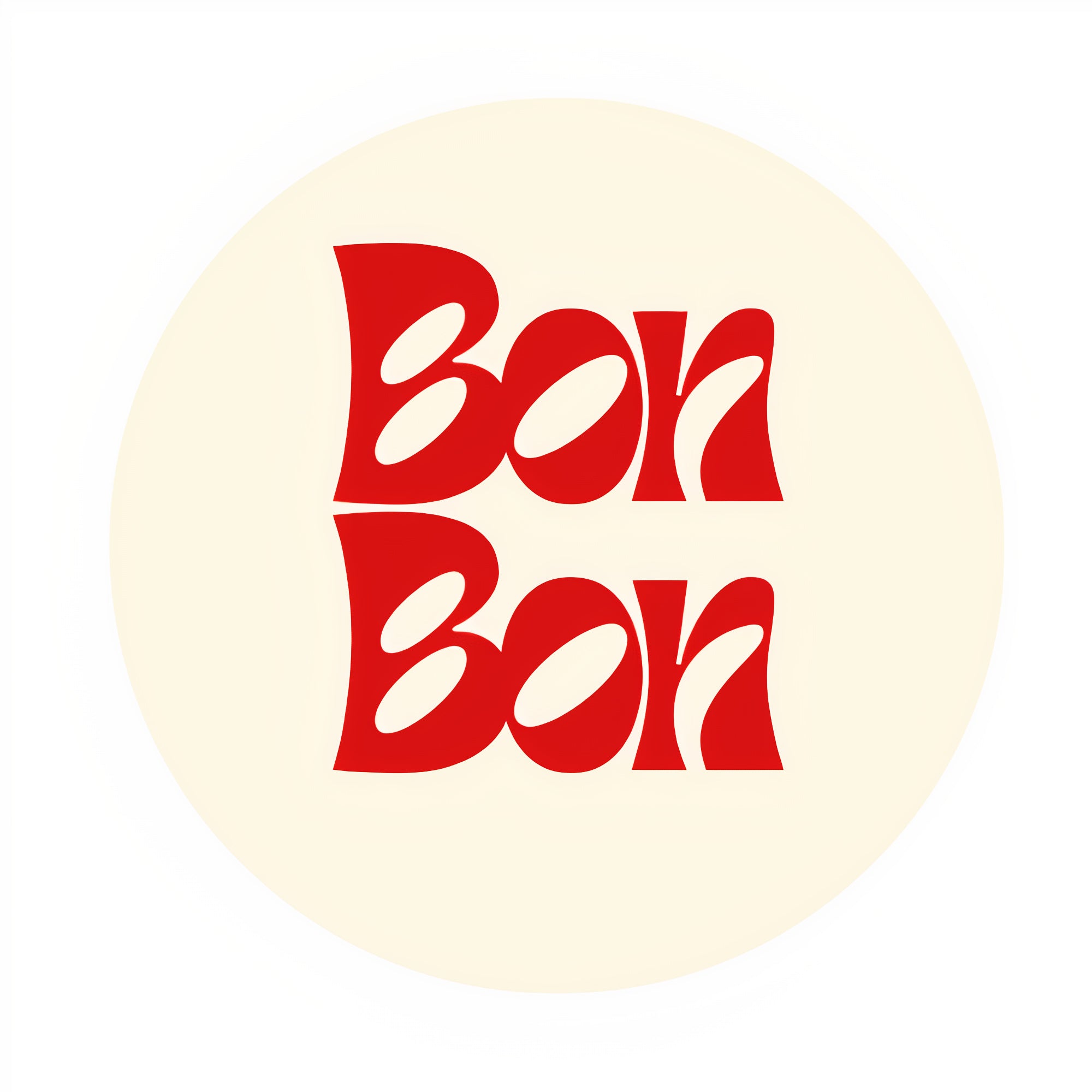
Our New Logo: A Bold Step into Colour and Fun!
We’re thrilled to unveil our new logo, designed to reflect the vibrant, playful spirit of our brand. With bold, bright colours and retro-inspired typography, we’re embracing a more dynamic, fun-filled identity that speaks to both the present and the past.
The new logo features a striking bright red that pops with energy, paired with a typography style that harks back to the charm and nostalgia of retro design. It’s a nod to a time when things felt simpler, yet full of character, and we’re bringing that sense of joy and excitement into everything we do.
Our rebrand is all about showing our fun-loving, approachable side while celebrating the timelessness of retro aesthetics. We hope you’ll feel the energy, creativity, and playfulness we’ve injected into our new look—because we believe it’s a true reflection of who we are and where we’re going.
Here’s to more colour, more fun, and more nostalgia in everything we create!


